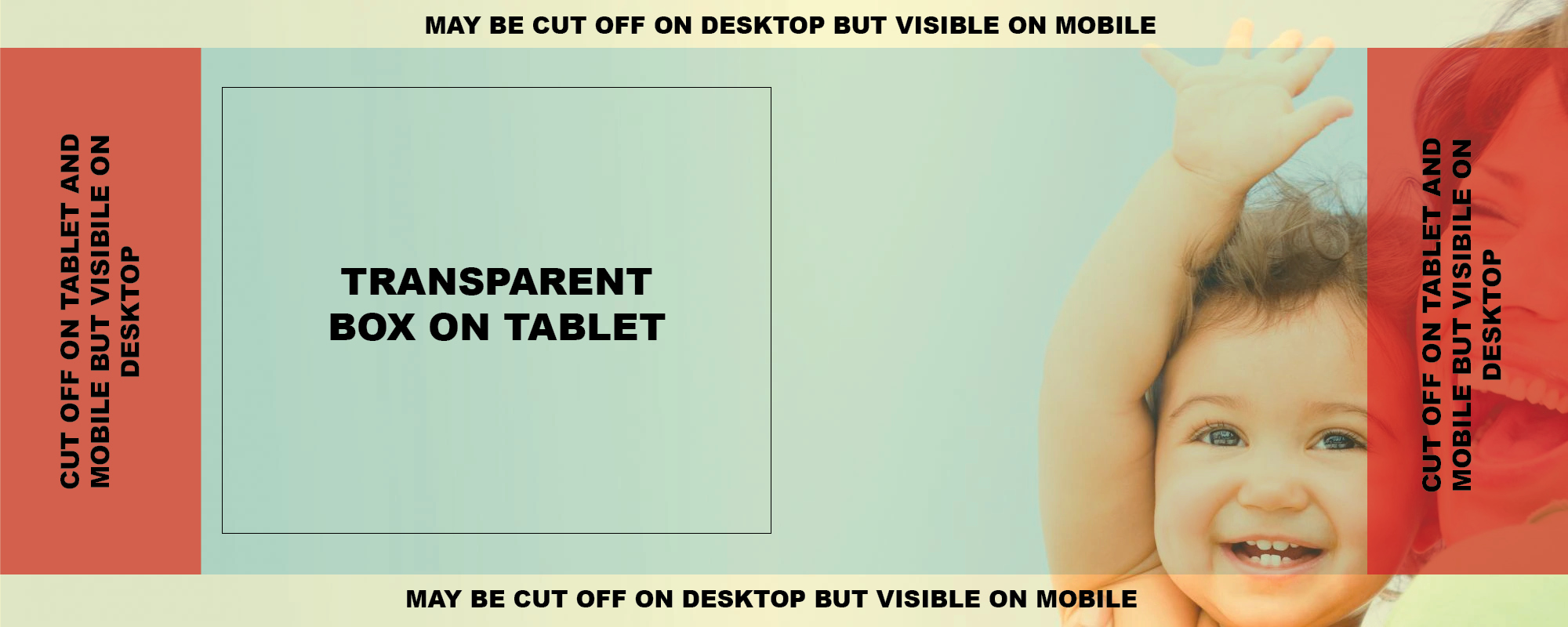
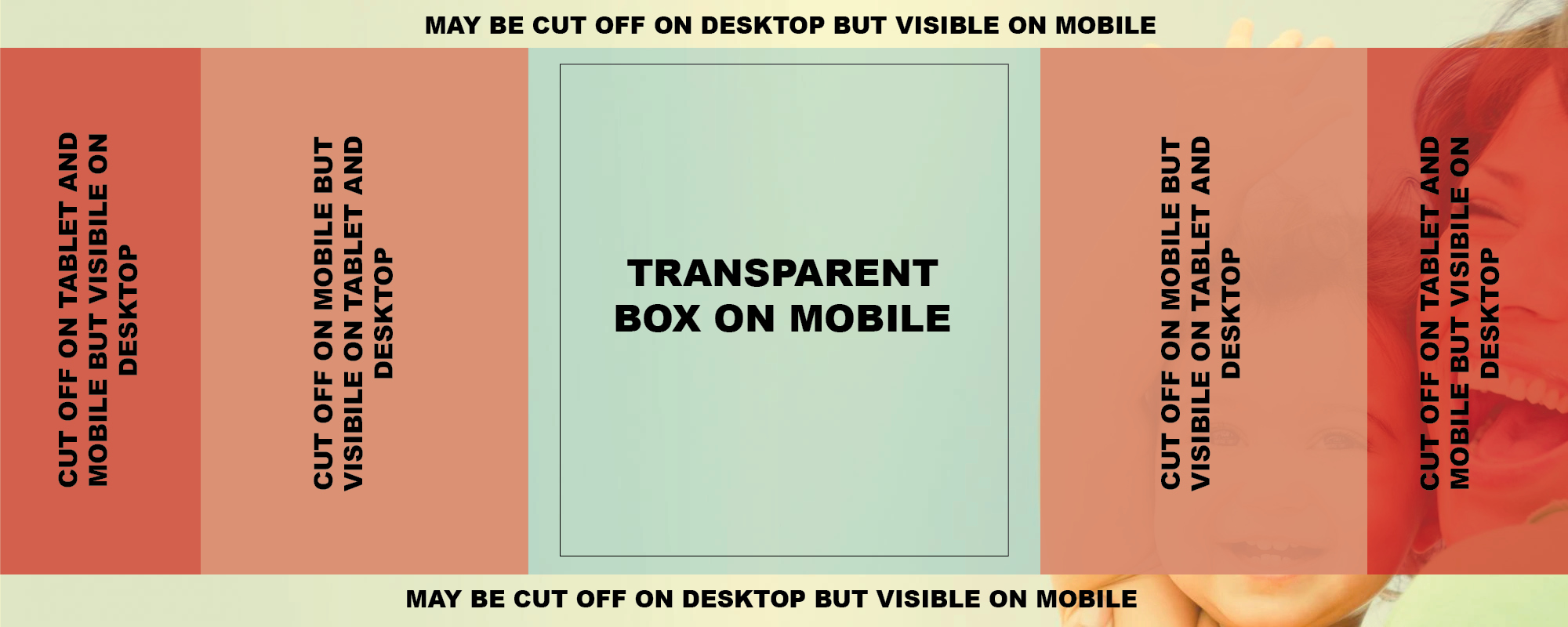
A hero promotes a key page or encourages a user to take an action.
Where it displays: Homepage, at the top of the page
Required or optional: Required
Use: For news or announcements
Don’t use: On internal landing pages
Fields
| Name of Field | Required/Optional | Case | Character Count | Number (min/max) | Size | Details |
|---|---|---|---|---|---|---|
|
Title |
Required |
Title Case |
Maximum 40 |
1 |
|
|
|
Subtitle |
Optional |
Sentence Case | Maximum 95 |
0-1 |
|
|
|
Button |
Optional |
Sentence Case |
Maximum 20 |
0-1 |
|
|
|
Image |
Required | 1 | 2000x800 | focus just right of center - edges will be cut off at different widths |
Example
Wide Screen


Medium Screen

Narrow Screen

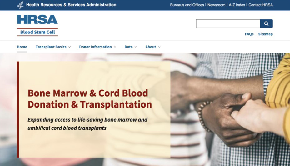
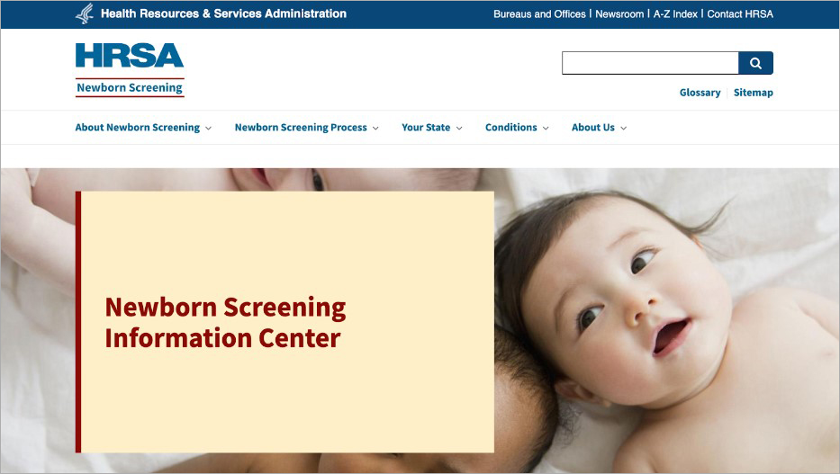
Live examples
Blood Stem Cell - Title and subtitle
Newborn Screening - Title only
Date Last Reviewed: