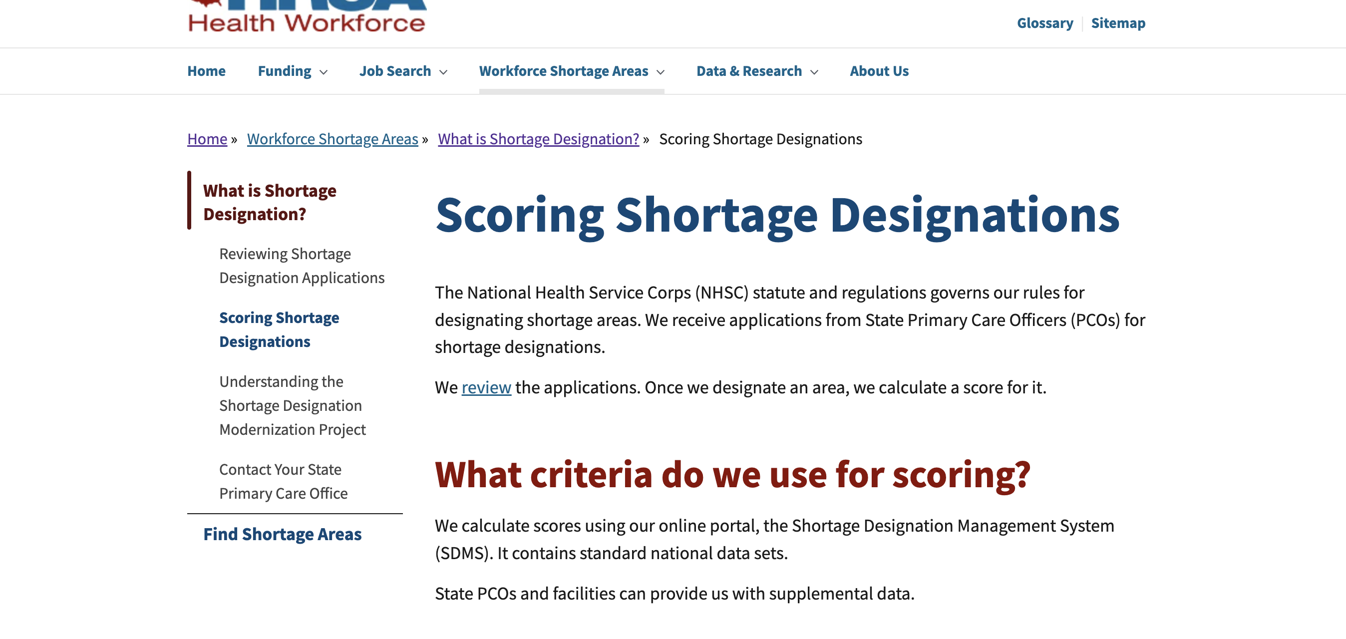
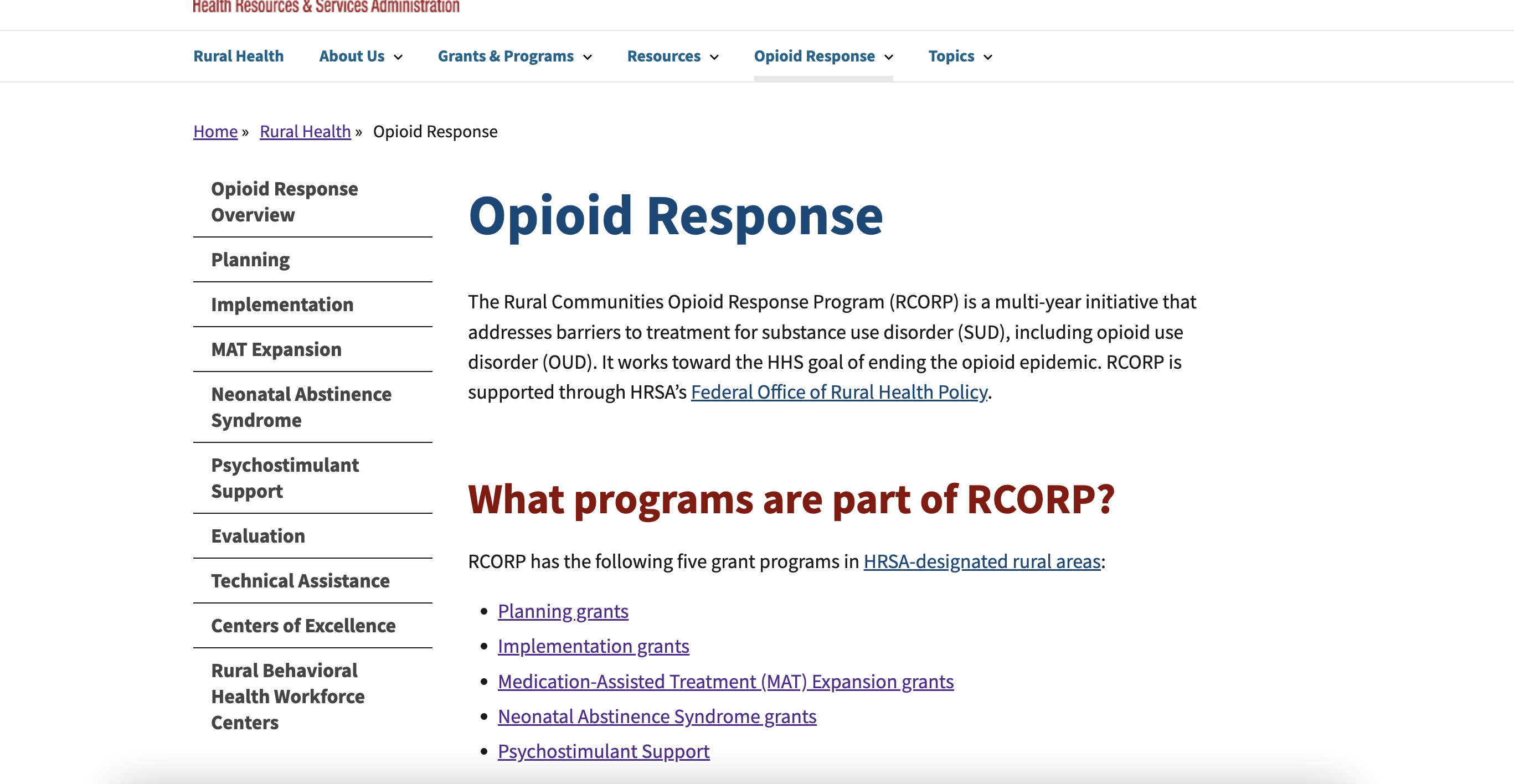
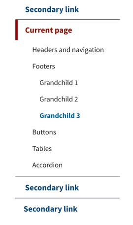
A sub-navigation displays an extra set of navigation links for the current section of a website. This allows users to easily navigate between pages.
Where it goes: Left of the main content
Required or optional: Optional
Use:
- When there are a lot of pages under the same topic within one section of a website, and users are likely to want to navigate between pages.
- When you want to make it easier for users to discover content.
- To act as a table of contents when you have report-type content that you’ve broken up into sections.
Don’t use: Small websites (e.g., a site with fewer than five pages)
Usability notes
Keep the navigation links short. A navigation link does not need to be the same as the title of the page it links to, if you can convey the same meaning in a shorter word/phrase.
Accessibility notes
Ensure the side navigational system is keyboard accessible. Users should be able to tab through each link.
Example
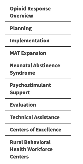
One level
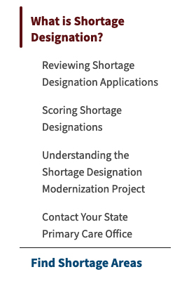
Two levels
Three levels
Live examples
