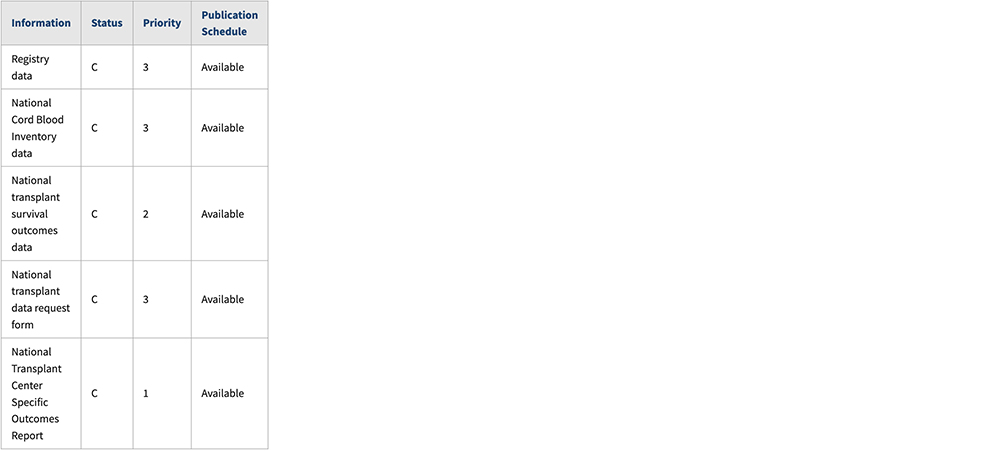
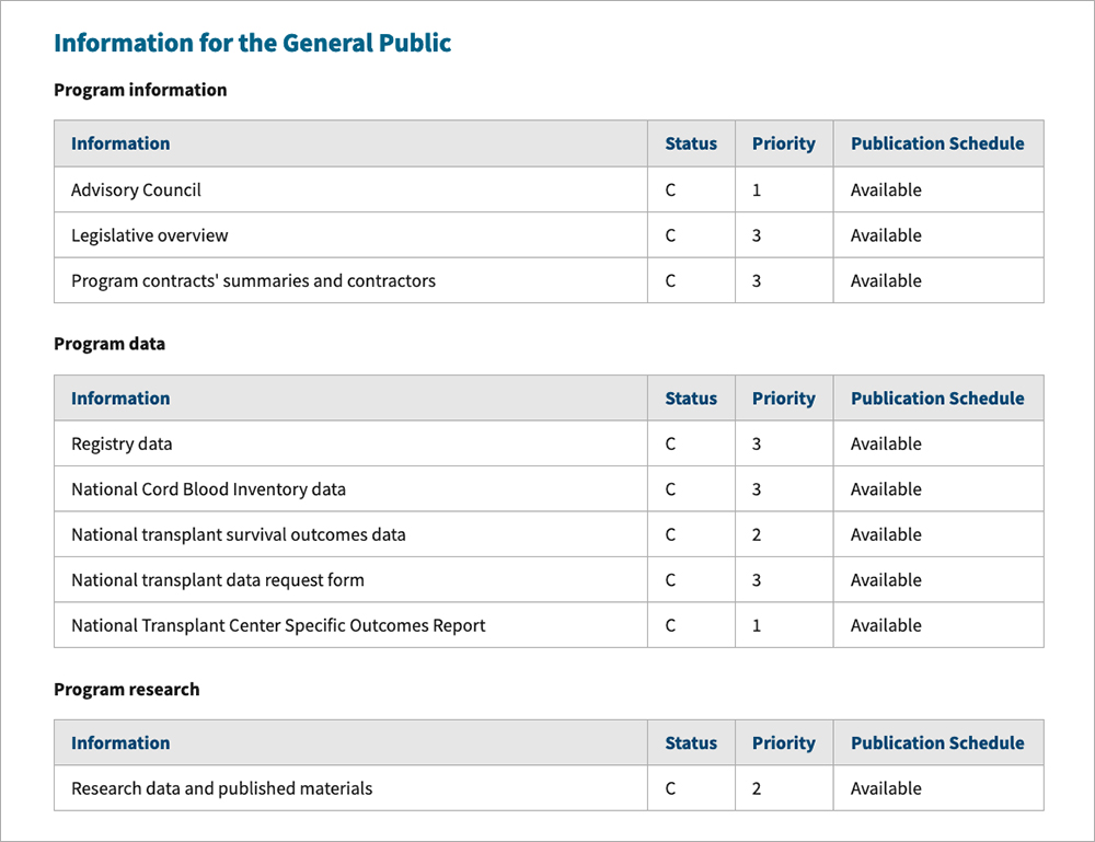
A table displays content using rows and columns
Where it goes: In page content
Use: When you have data that’s easiest to read in rows and columns with headers on one or both axes.
Don’t use: For simple data that you can easily describe in regular text. Often, a definition list or bulleted list is more effective than a table.
Additional Instructions
- Right-align numerical data.
- Align headers with their data.
- Enable row sorting only if it can assist the user in completing a task.
- Tables are auto width by default, but content editors can make them full width if needed for consistency, or change column widths.
Usability Notes
- Styles are already set up for tables, including headers. Do not add additional styles.
- Every table must include a
<caption>element that describes the contents of the table.
Accessibility Notes
- Tables must have
<th>header cells either along the top or left axis. - Avoid using merged cells.
Example
Wide Screen

Medium Screen

Narrow Screen

Variations
Bordered Table

Borderless Table

Live examples


Date Last Reviewed: